07 / 07
Rané
Visual identity, packaging and brand universe for Rané, a Mediterranean grocery store.
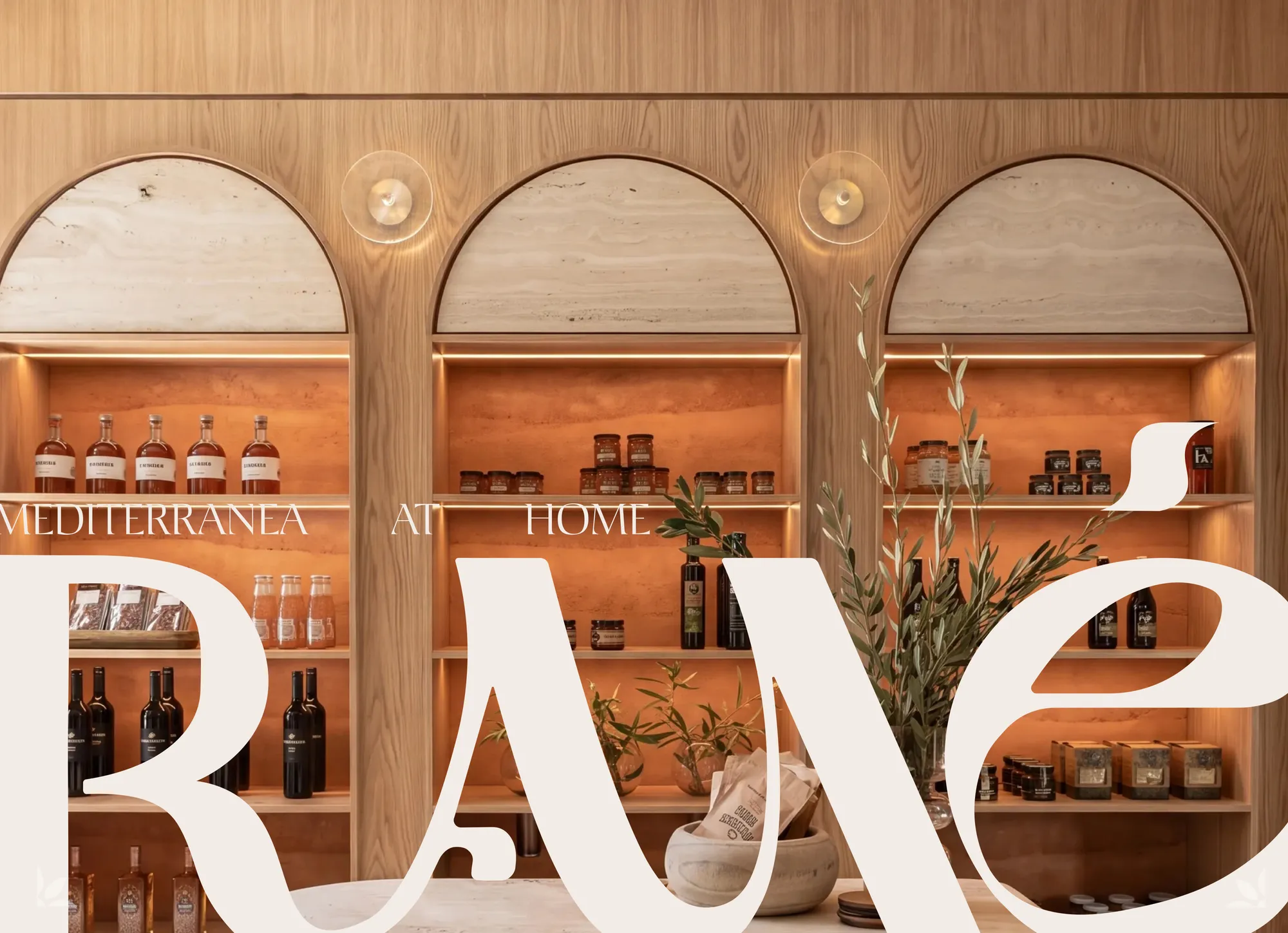
Mediterranea at home
An international fine-food store with Mediterranean flavours: logotype, palette, patterns, packaging and store universe.
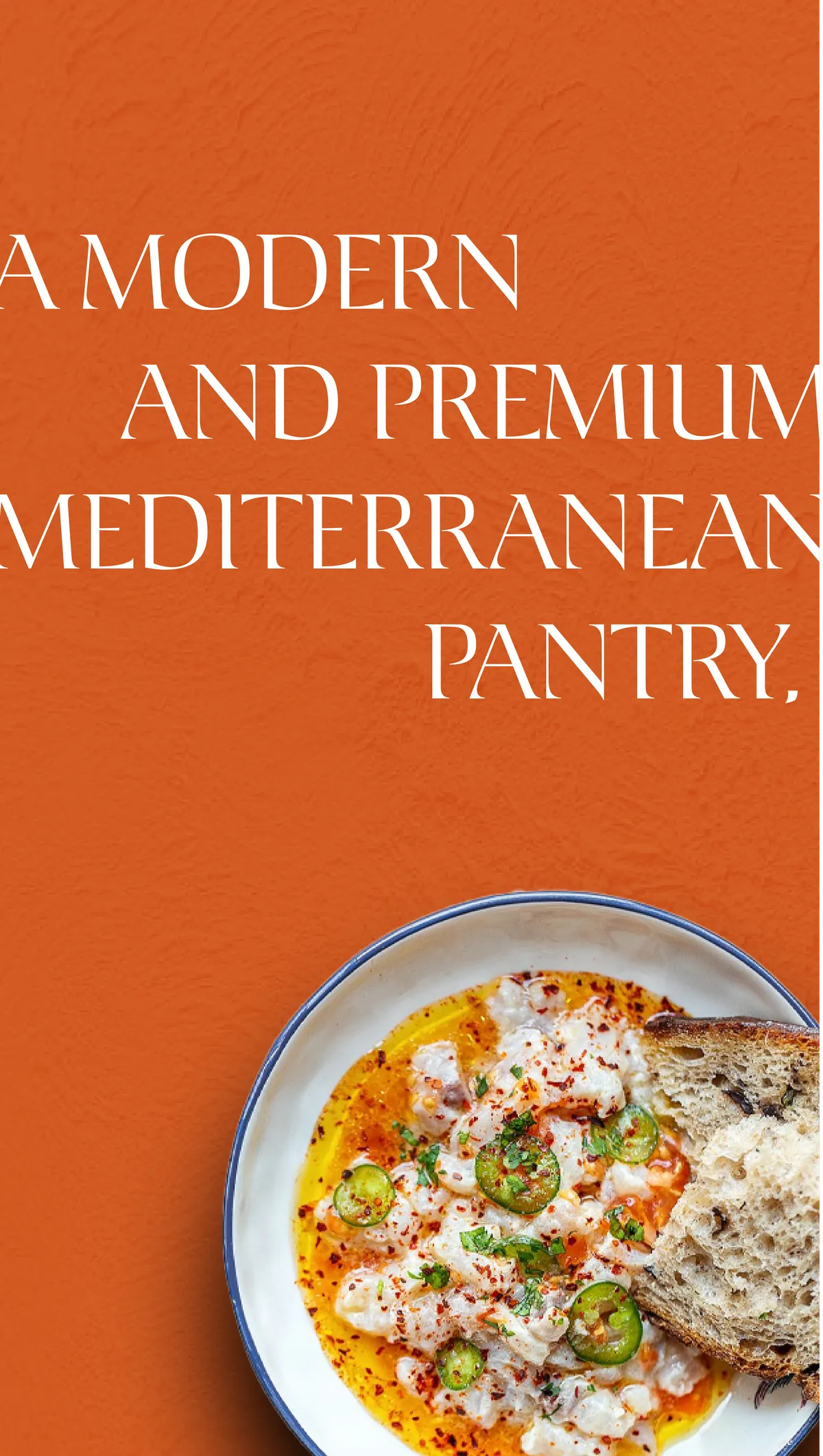
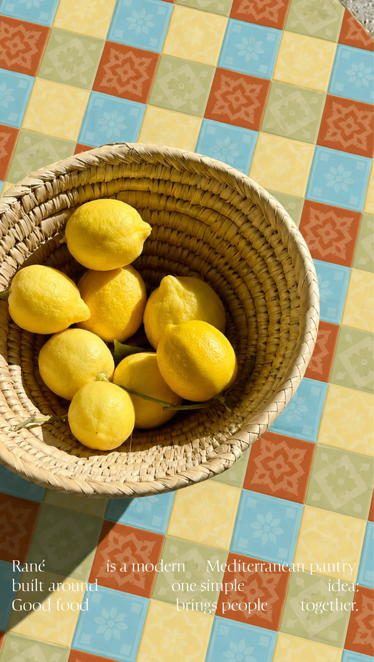
Rané is a modern, premium Mediterranean grocery store built around one simple idea: good food brings people together. We created a warm, open identity that turns a name into a true signature.
01
Context
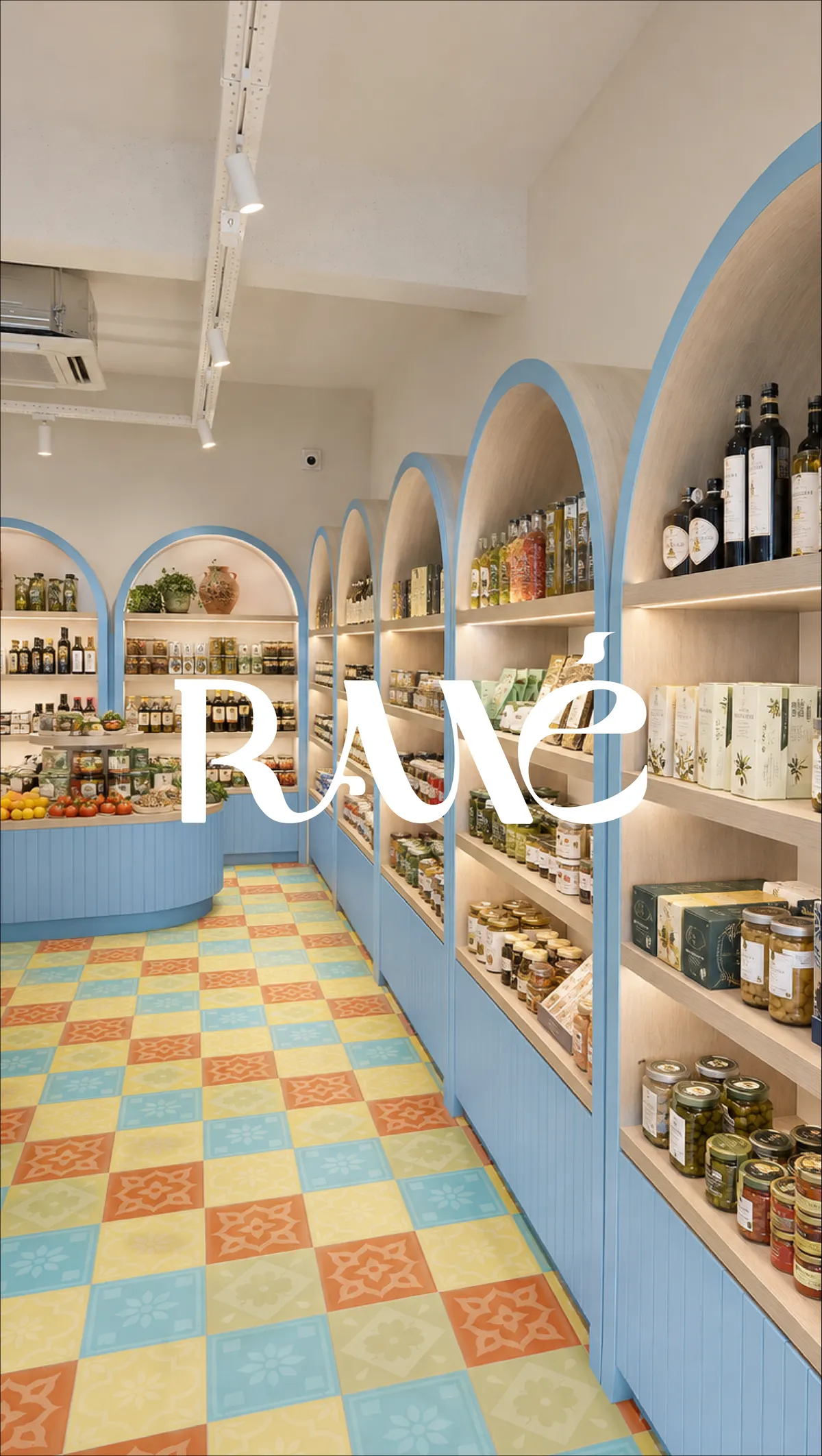
Rané is an international fine-food store dedicated to Mediterranean products: oils, olives, pasta, preserves and wines. Its ambition is to offer a modern, premium Mediterranean pantry for people who believe that what we eat is part of how we live.
02
The challenge
Fine-food stores often play the old-world heritage card or a distant kind of luxury. Rané wanted the opposite: an open, warm and contemporary brand able to bring the diversity of Mediterranean cuisines together under one signature, from the shelf to social media.
03
Our approach
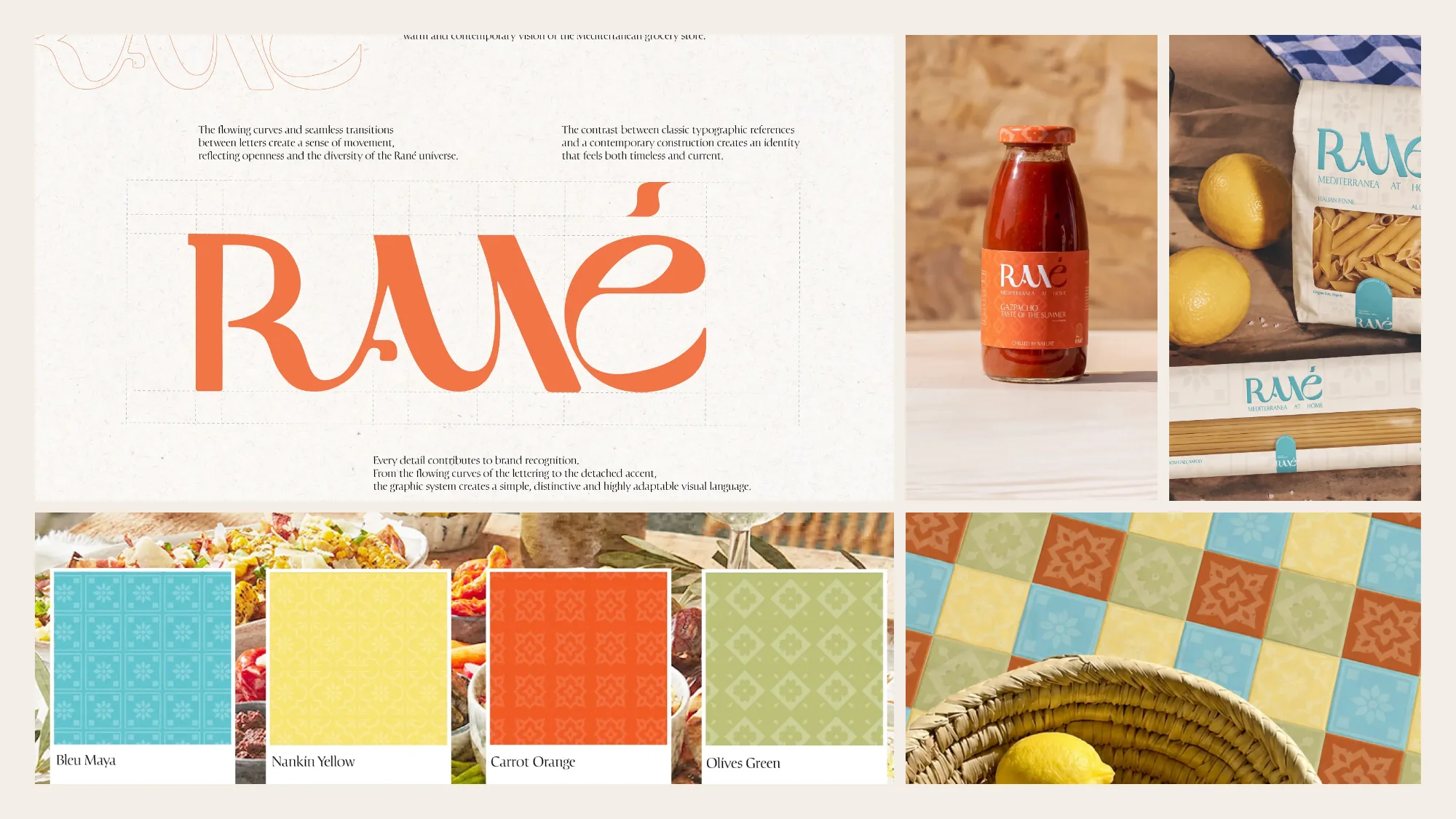
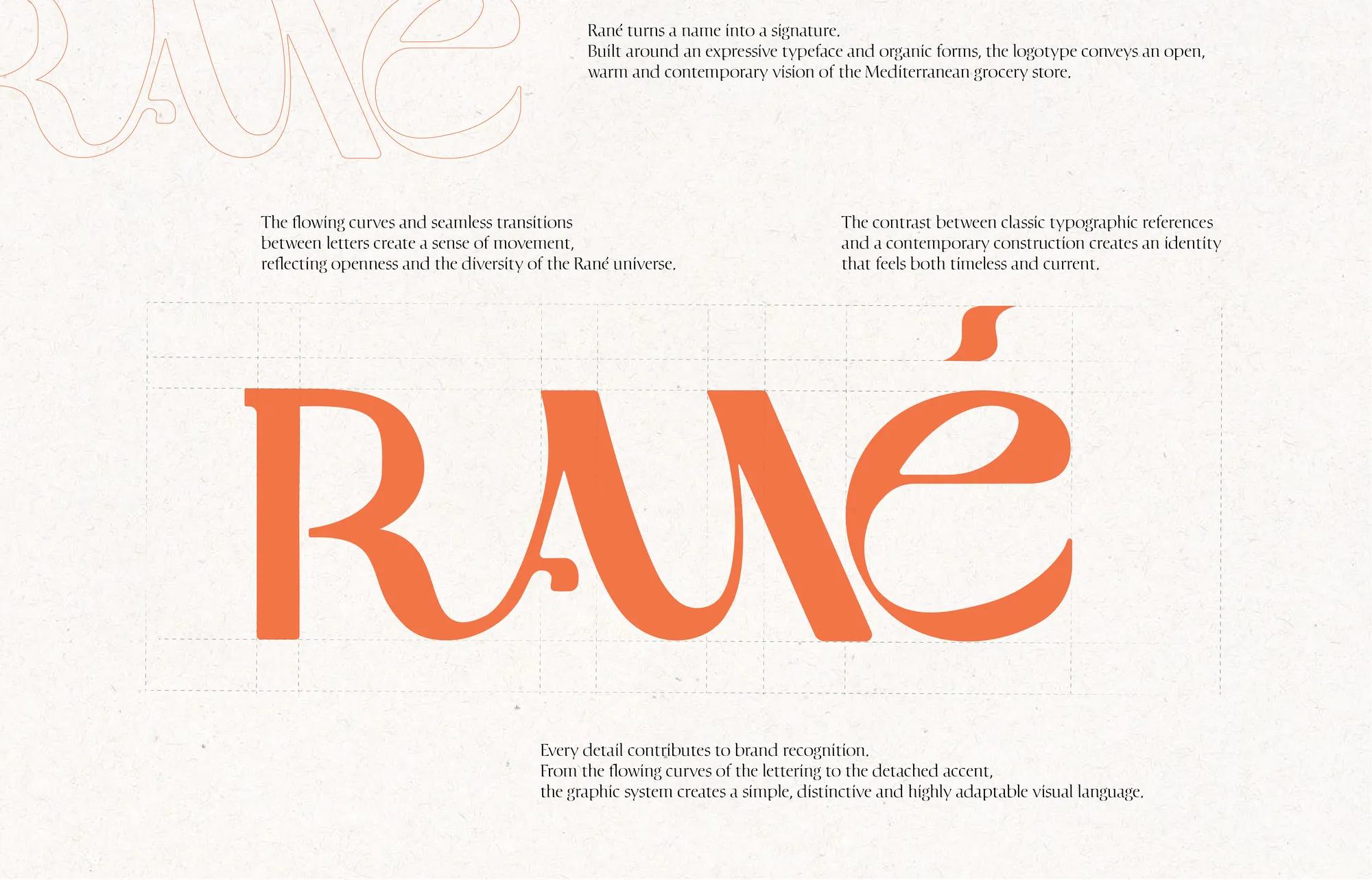
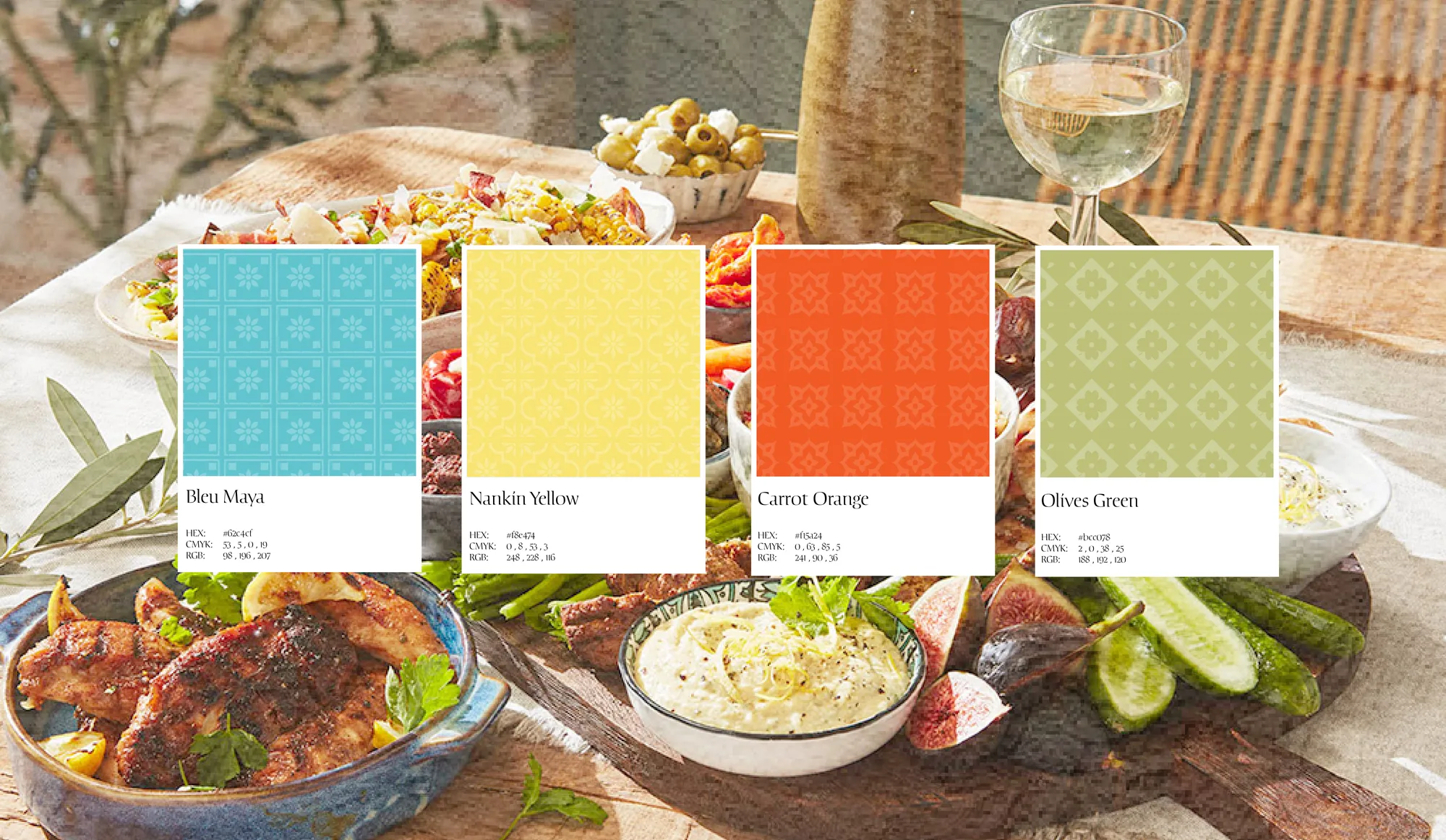
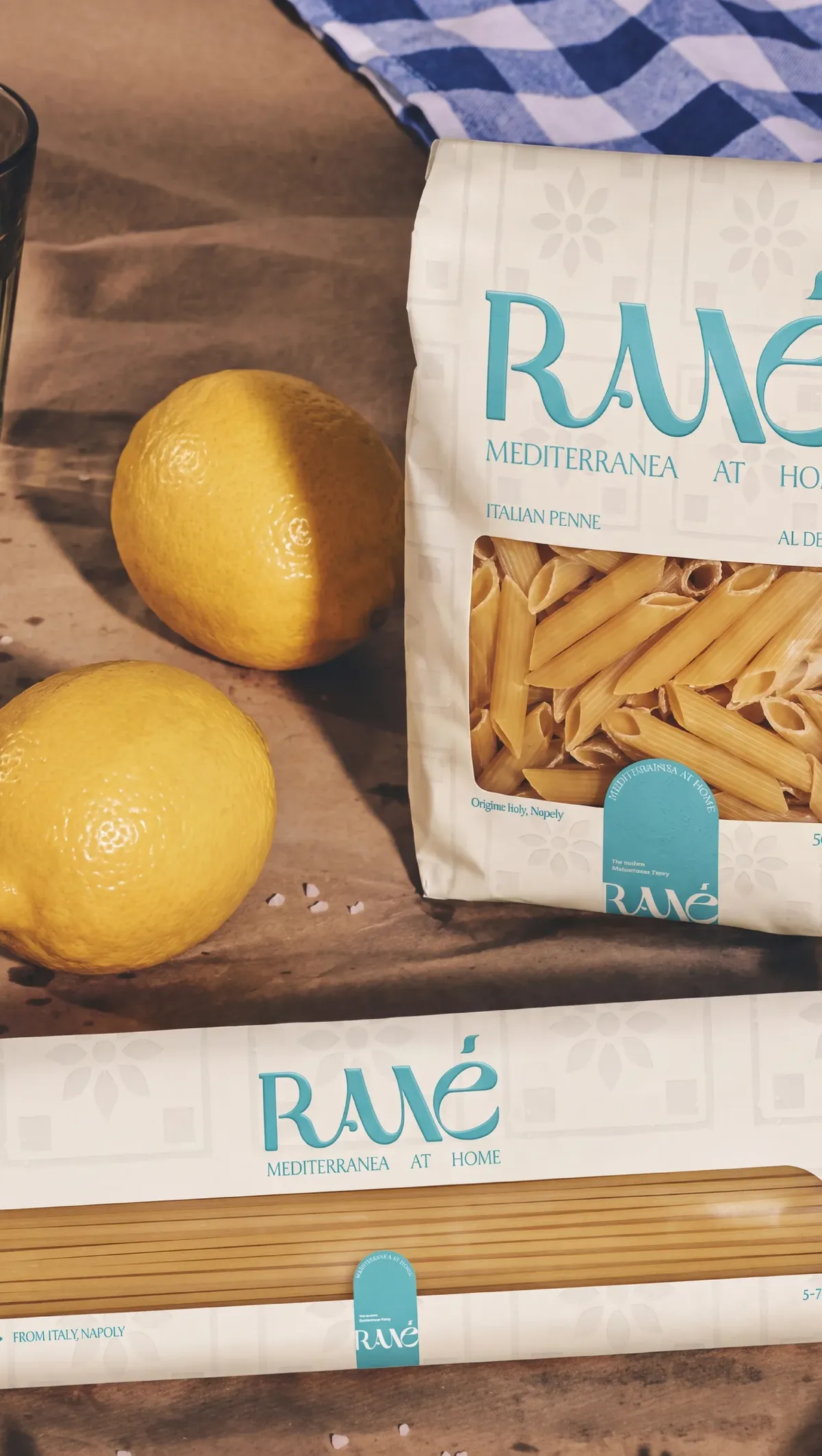
We drew a logotype around an expressive typeface with flowing curves: the letters connect seamlessly and the accent stands apart, creating movement and making the brand recognisable at first glance. Classic typographic references meet a contemporary construction. Around it, a four-colour palette, Maya blue, Nankin yellow, carrot orange and olive green, is turned into patterns inspired by Mediterranean cement tiles and gives each product range its own colour.
04
What we delivered
- Logotype and typographic construction
- Colour palette and patterns
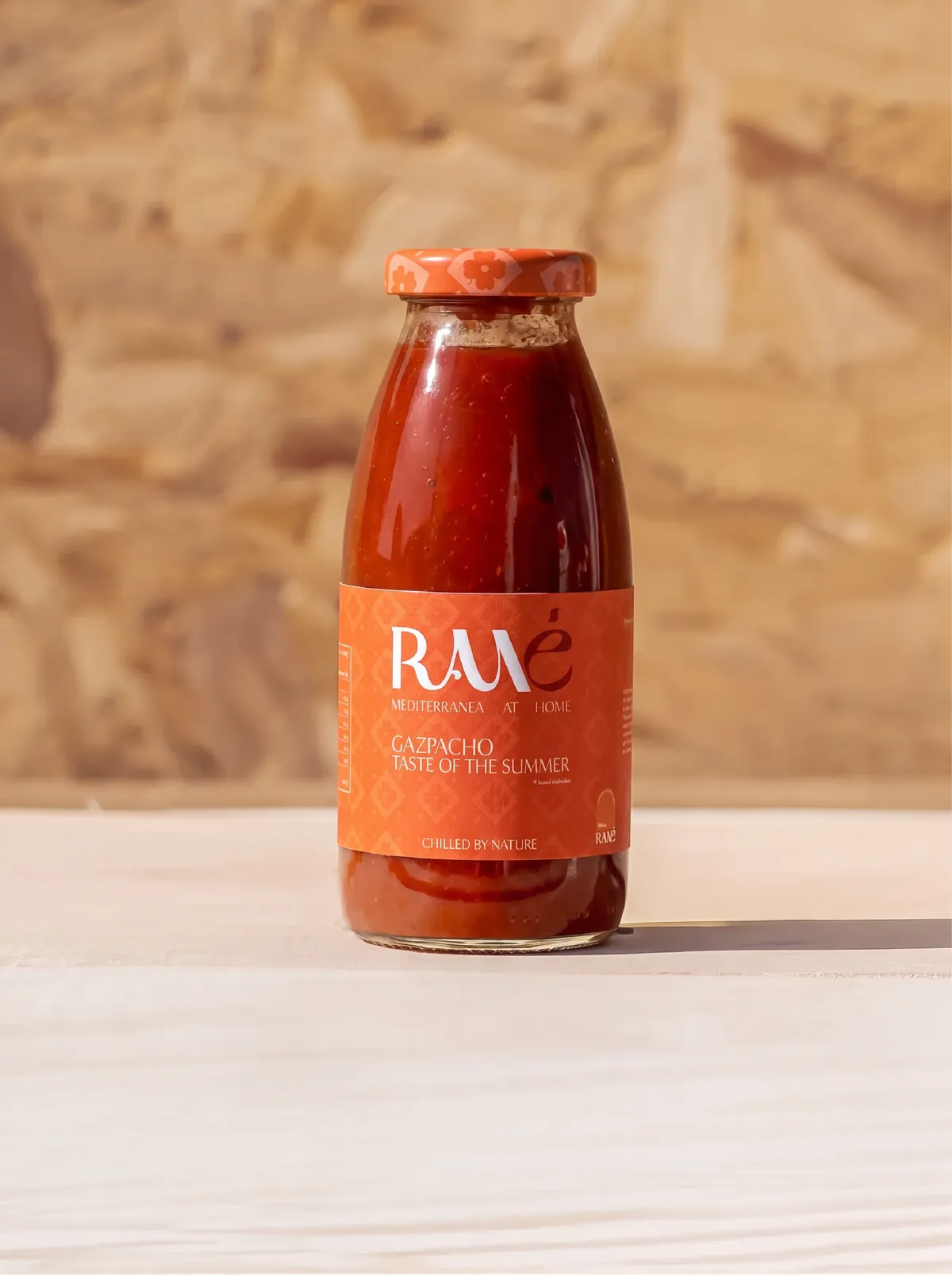
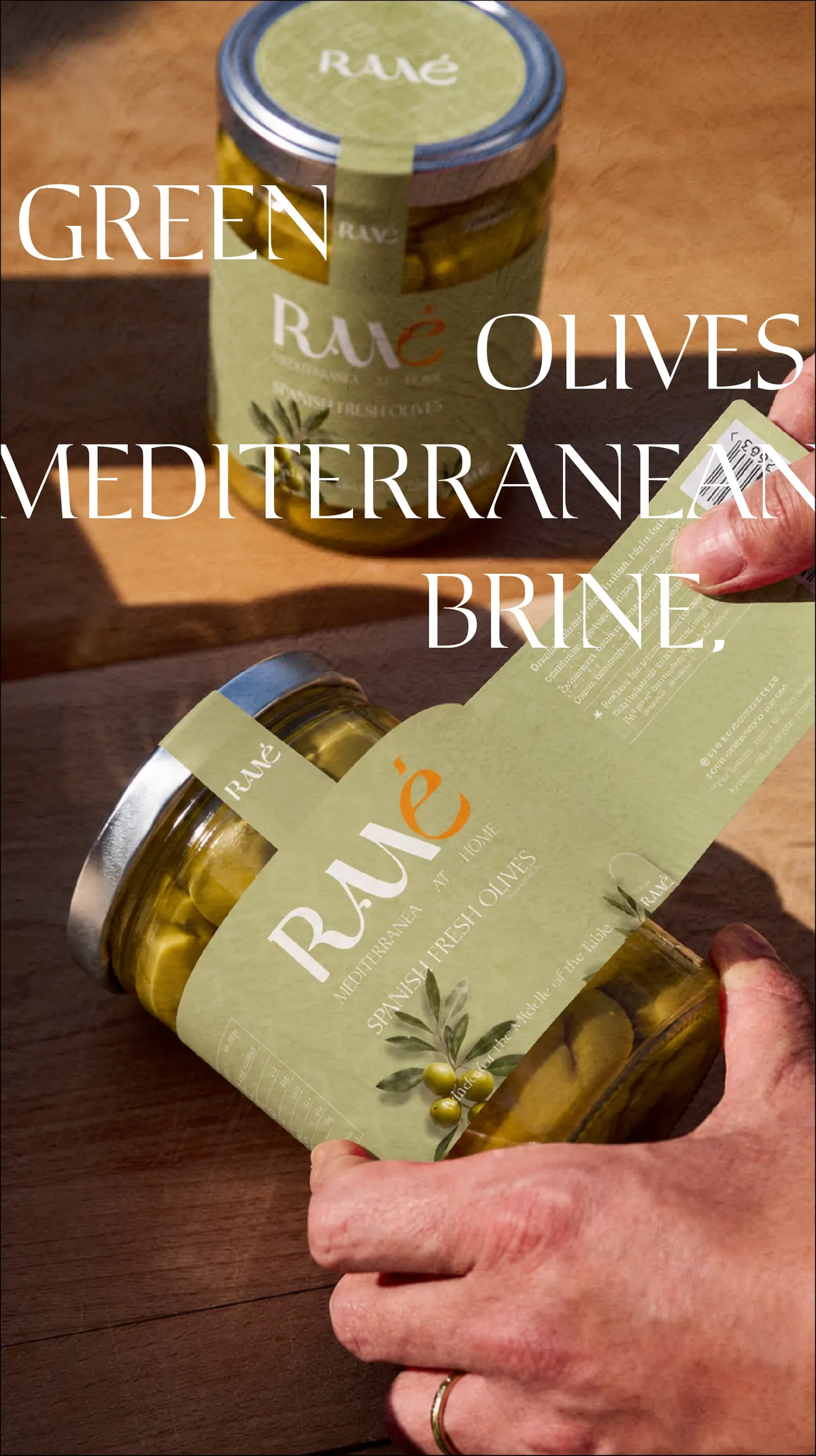
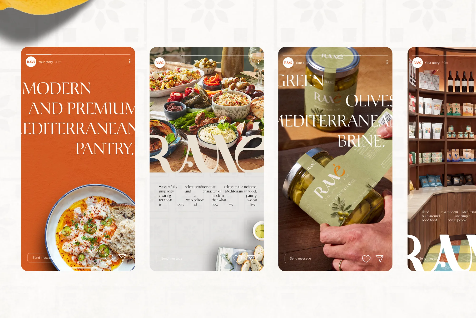
- Packaging: gazpacho, olives, pasta
- Store universe
- Instagram stories and social media content
- “Mediterranea at home” signature
05
The outcome
Rané has a simple, distinctive and highly adaptable visual language: the same signature moves from a jar label to the store interior or an Instagram story while staying instantly recognisable.
A similar project?
Let’s talk about your brand: free first conversation, reply within two working days.
Let’s talk about your project